How Can We Help?
Uplift Performance
How do I evaluate the performance of my Uplift pipeline?
Once you’ve built an Uplift pipeline, Cortex makes it easy to explore results and learn more about your pipeline’s predictive power. In this guide, we’ll show you how to evaluate the performance of an Uplift pipeline in Cortex.
Cortex summarizes performance of any pipeline in three ways: Pipeline Quality, Performance Metrics, and Performance Graphs. The following sections describe how to interpret each of these specifically for an Uplift pipeline.
Uplift Pipeline Quality
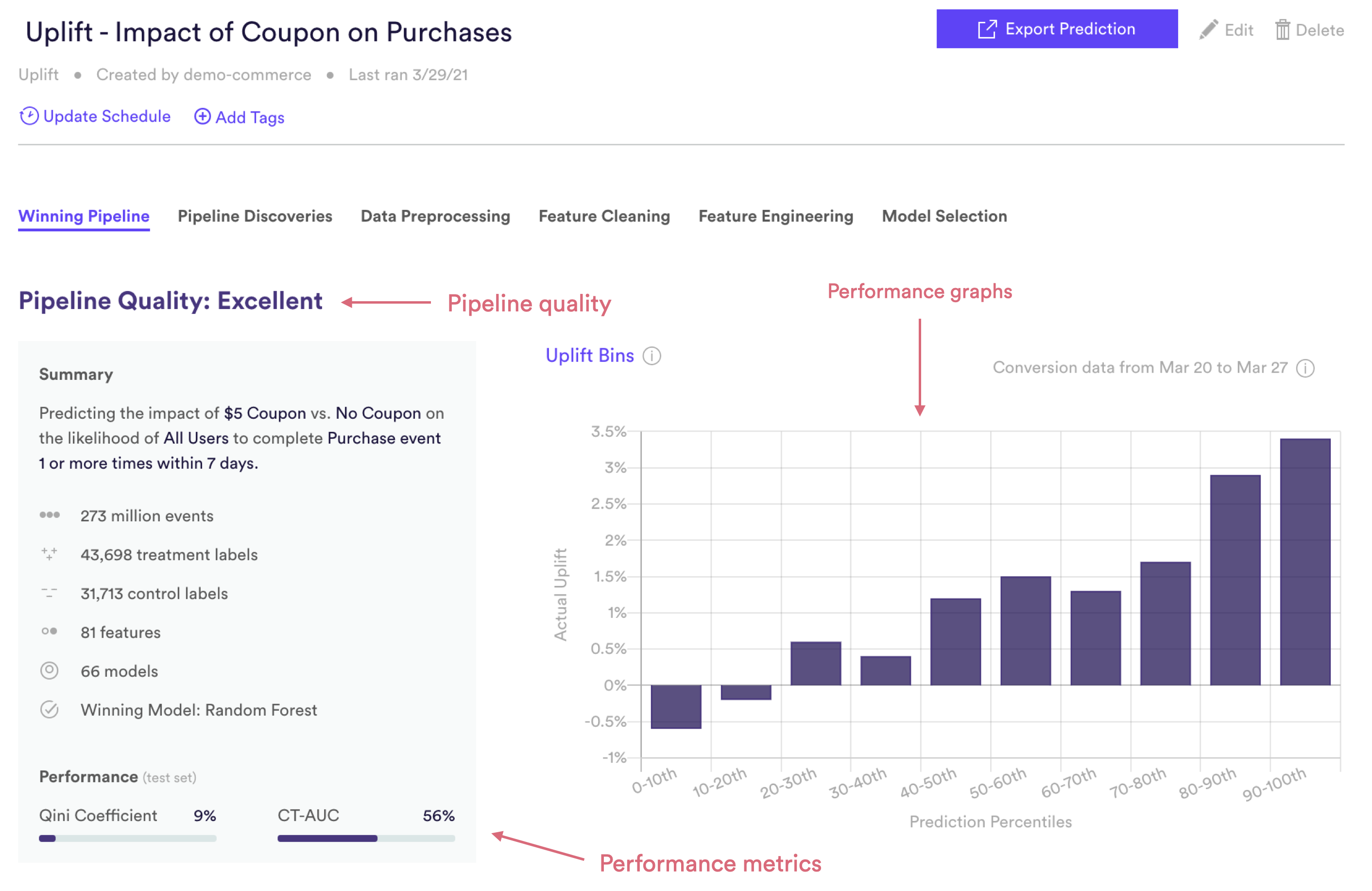
Pipeline Quality gives you a quick sense for your pipeline’s performance without having to scrutinize any technical metrics. A pipeline’s Quality is meant to serve as a rough guide for how well its predictions match reality, but in truth what constitutes good performance depends on the difficulty of the problem — sometimes “Average” actually represents the best possible performance that can be achieved with the data at hand. For Uplift in particular, your pipeline may not have found much uplift because in fact your intervention was not able to meaningfully influence user behavior.
For Uplift, Pipeline Quality is determined based on Qini coefficient. This performance measure is described in more detail in the Metrics section below.
| Pipeline Quality | Qini Coefficient |
| Excellent | >5% |
| Very Good | 3 – 5% |
| Good | 1.5 – 3% |
| Average | 1 – 1.5% |
| Below Average | <1% |
Uplift Performance Metrics
Cortex publishes two commonly used performance metrics for each Uplift pipeline. Each of these metrics is computed on a test set — that is, a random collection of users withheld from training so that we can measure performance on data your pipeline has never seen before. Uplift predictions on the test set are also wound back in time so that we can compare them against which users actually went on to convert after your A/B test.
To frame these metrics in real terms, consider an Uplift pipeline which predicts the impact of a coupon code on each user’s likelihood to purchase within the next 14 days. Note however that your Cortex account can be configured to make predictions about any type of object tied to your event data (e.g. commerce items, media content, home listings, etc.).
Qini Coefficient
The Qini coefficient is a measure of how your pipeline’s uplift predictions compare to random targeting and a theoretical “perfect” targeting. First, a Qini curve is generated which computes: for the top N users (based on predicted uplift score), how many extra conversions would we get by treating those users, compared to if we did not treat them? The Qini coefficient is then calculated based on the area under this curve, re-scaled so that 0% is equivalent to random targeting and 100% is equivalent to “perfect” targeting. Read here for more details.
CT-AUC
One of the ML techniques that Cortex employs when training an Uplift pipeline is called Class Transformation. This method transforms the uplift problem into a more standard classification model, where…
- A user is a positive label if (treatment = 1 & conversion = 1) OR (treatment = 0 & conversion = 0)
- A user is a negative label if (treatment = 1 & conversion = 0) OR (treatment = 0 & conversion = 1)
This transformation is useful because it ensures that all persuadable users (those who will only convert with treatment) are grouped together. It also allows us to evaluate the resulting model as we would any other classifier (e.g. Future Events or Classification).
AUC (or AUROC, short for Area Under the Receiver Operating Characteristics curve) is one of the most commonly-used measures of performance for machine learning classifiers. It is represented as a percentage from 0-100% — the higher your pipeline’s AUC, the better its predictive power.
AUC is derived from the ROC curve (read here for more details), but can be interpreted in a more intuitive way: if a positive and negative label are both drawn at random, what is the probability that the positive label was given a higher prediction than the negative label? In our example above, a positive label is a user who purchased within 14 days, while a negative label is a user who did not end up purchasing in the window.
Uplift Performance Graphs
Like the performance metrics described above, performance graphs are generated based on data from a test set — that is, a random collection of users withheld from training so that we can measure performance on data your pipeline has never seen before. Uplift predictions on the test set are also wound back in time so that we can compare them against which users actually went on to convert after your A/B test.
Uplift Bins
Uplift Bins visualize how well your pipeline is able to rank users based on their likelihood of uplift. To do this, Cortex takes a set of users that were withheld from training (called the test set) and divides them into 10 equally-sized bins based on their predicted uplift scores. The first bin (0-10th percentile) contains the 10% of users with the lowest predictions, while the tenth bin (90-100th percentile) contains the 10% with the highest predictions. Cortex then observes what percent of users in each bin actually went on to convert from the Treatment group vs. Control group. For example, if 10% of the Treatment users in bin #1 converted while 5% of Control users in bin #1 converted, then the actual uplift in bin #1 would be (10% – 5%) = 5%. These results are visualized for every bin in the Uplift Bins graph.
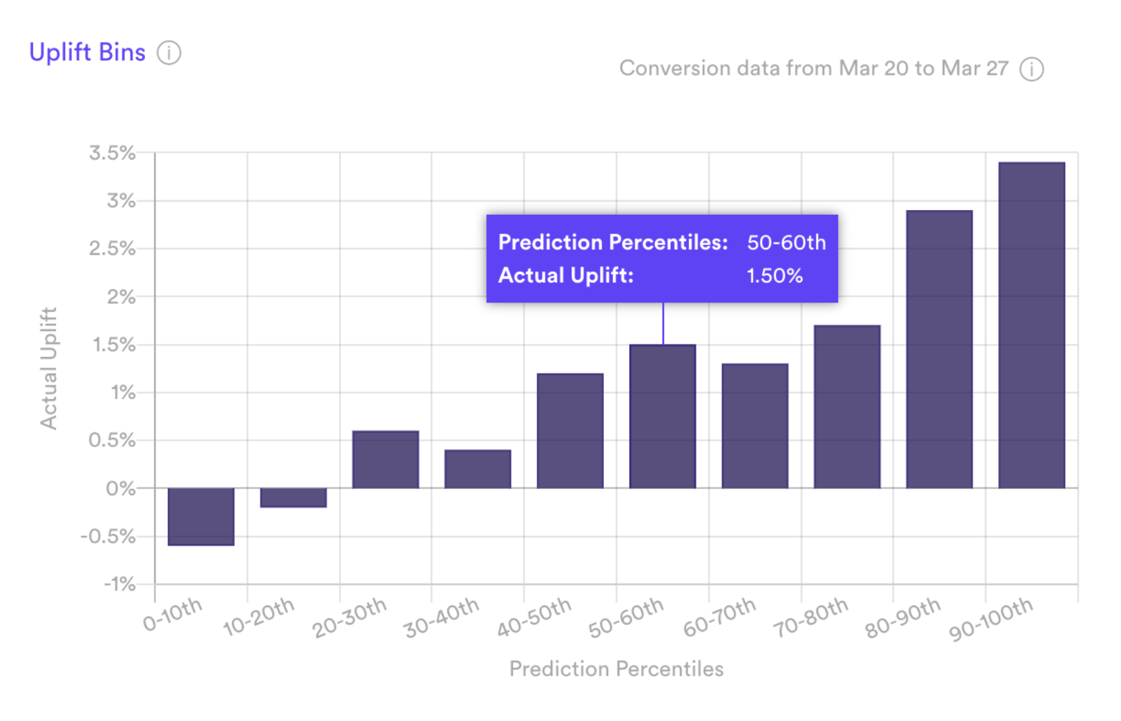
If your pipeline’s predictions are accurate, actual uplift will increase steadily and sharply from bin 1 to bin 10. This indicates that the users predicted as high uplift do in fact show more lift from Treatment than the users your pipeline identified as lower uplift.
Related Links
- Building an Uplift Pipeline
- Future Events Pipeline Performance
- Look Alike Pipeline Performance
- Classification Pipeline Performance
- Regression Pipeline Performance
- Recommendations Pipeline Performance
Still have questions? Reach out to support@mparticle.com for more info!