How Can We Help?
Regression Performance
How do I evaluate the performance of my Regression pipeline?
Once you’ve built a Regression pipeline, Cortex makes it easy to explore results and learn more about your pipeline’s predictive power. In this guide, we’ll show you how to evaluate the performance of a Regression pipeline in Cortex.
Cortex summarizes performance of any pipeline in three ways: Pipeline Quality, Performance Metrics, and Performance Graphs. The following sections describe how to interpret each of these specifically for a Regression pipeline.
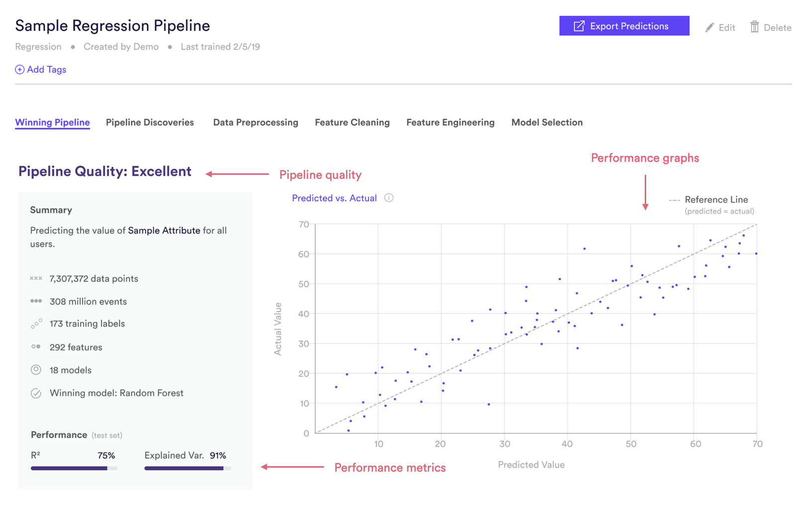
Regression Pipeline Quality
Pipeline Quality gives you a quick sense for your pipeline’s performance without having to scrutinize any technical metrics. A pipeline’s Quality is meant to serve as a rough guide for how well its predictions match reality, but in truth what constitutes good performance depends on the difficulty of the problem – sometimes “Average” actually represents the best possible performance that can be achieved with the data at hand.
For Regression, Pipeline Quality is determined based on R², a common measure of performance for regression machine learning. R² is described in more detail in the Metrics section below.
| Pipeline Quality | R² |
| Excellent | >75% |
| Very Good | 60-75% |
| Good | 40-60% |
| Average | 25-40% |
| Below Average | <25% |
Regression Performance Metrics
Cortex publishes two well-known performance metrics for each Regression pipeline. Each metric is computed on a test set — that is, a random subset of your uploaded labels that Cortex withheld from training. This allows us to measure performance on data your pipeline has never seen before.
To frame these metrics in real terms, consider a Regression pipeline which predicts the age of each user. Note however that your Cortex account can be configured to make predictions about any type of object tied to your event data (e.g. commerce items, media content, home listings, etc.).
R²
R² measures how well our model has fit the training data. Under a few assumptions, R² can be interpreted as the percentage of variation in our predicted attribute that can be explained by the model. In terms of our example, if two users have different ages, R² tells us how much of that difference can be explained by differences in those users’ features. Read here for more details.
Explained Variance
Explained variance is similar to R², but imposes additional penalties for a biased model (i.e. one whose predictions consistently over- or underestimate the true values). Read here for more details.
Regression Performance Graphs
Like the performance metrics described above, performance graphs are generated based on data from a test set — that is, a random subset of your uploaded labels that Cortex withheld from training. This allows us to measure performance on data your pipeline has never seen before.
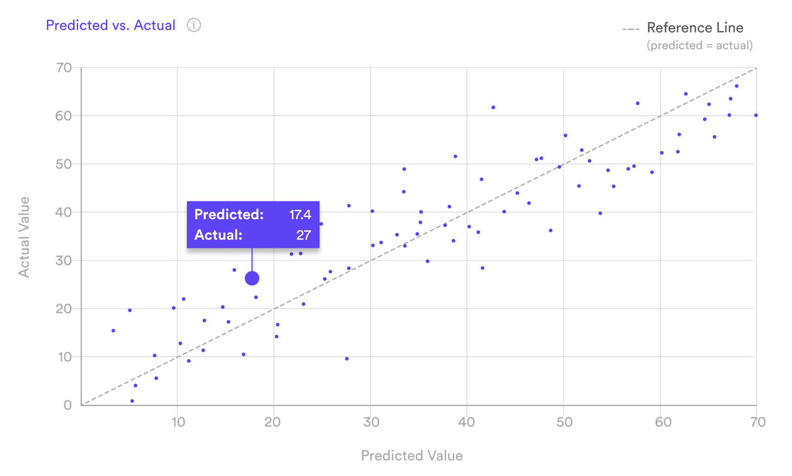
Predicted vs. Actual
The Predicted vs. Actual plot illustrates how your pipeline’s predictions compare to the true values that you uploaded. The 45° dashed reference line shows performance for a hypothetical perfect model, where every prediction exactly matches the actual value (e.g. a pipeline that always predicts exactly the right age for each user). The more tightly your predictions are clustered along this reference line, the better the performance of your pipeline.
The reference line should also roughly split your data points in two, meaning that your pipeline has low bias and is not consistently over- or underestimating its predictions.
Related Links
- Building a Regression Pipeline
- Classification Pipeline Performance
- Look Alike Pipeline Performance
- Future Events Pipeline Performance
- Uplift Pipeline Performance
- Recommendations Pipeline Performance
Still have questions? Reach out to support@mparticle.com for more info!