How Can We Help?
Look Alike Performance
How do I evaluate the performance of my Look Alike pipeline?
Once you’ve built a Look Alike pipeline, Cortex makes it easy to explore results and learn more about your pipeline’s predictive power. In this guide, we’ll show you how to evaluate the performance of a Look Alike pipeline in Cortex.
Cortex summarizes performance of any pipeline in three ways: Pipeline Quality, Performance Metrics, and Performance Graphs. The following sections describe how to interpret each of these specifically for a Look Alike pipeline.
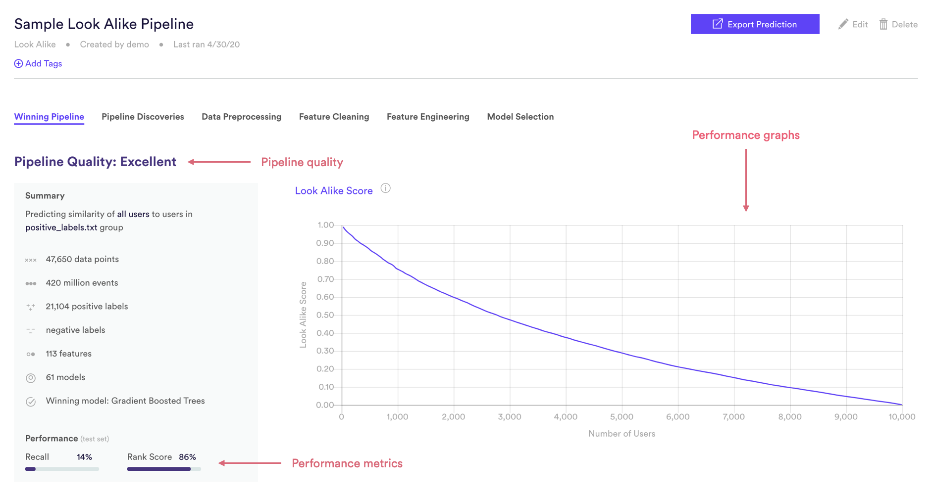
Look Alike Pipeline Quality
Pipeline Quality gives you a quick sense for your pipeline’s performance without having to scrutinize any technical metrics. A pipeline’s Quality is meant to serve as a rough guide for how well its predictions match reality, but in truth what constitutes good performance depends on the difficulty of the problem – sometimes “Average” actually represents the best possible performance that can be achieved with the data at hand.
For Look Alike, Pipeline Quality is determined based on Rank Score, a proprietary measure of performance developed by Cortex for one-class classification machine learning. Rank Score is described in more detail in the Metrics section below.
| Pipeline Quality | AUC |
| Excellent | >85% |
| Very Good | 75-85% |
| Good | 65-75% |
| Average | 55-65% |
| Below Average | <55% |
Look Alike Performance Metrics
Cortex publishes two performance metrics for each Look Alike pipeline. Each metric is computed on a test set — that is, a random subset of your uploaded labels that Cortex withheld from training. This allows us to measure performance on data your pipeline has never seen before.
To frame these metrics in real terms, consider a Look Alike pipeline which predicts each user’s similarity to a set of known CEOs. Note however that your Cortex account can be configured to make predictions about any type of object tied to your event data (e.g. commerce items, media content, home listings, etc.).
Rank Score
Rank Score is a proprietary metric which calculates how highly positive labels were scored relative to all users. This score is represented as a percentage (0-100%), and can be interpreted as the average percentile rank of the predictions for actual positives. In terms of our example, a positive label is a user within our set of known CEOs, so the rank score describes how highly known CEOs are ranked relative to all other users
Recall
Of all the users that were actually in the positive class, what percentage did your pipeline predict to be in the positive class? In terms of our example, of all the users predicted to be CEOs, what percent actually are CEOs? Read here for more details.
*Note: Recall is reported at the maximum F1 score for each Look Alike pipeline, where all unlabeled users are treated as negative.
Look Alike Performance Graphs
Like the performance metrics described above, performance graphs are generated based on data from a test set — that is, a random subset of your uploaded labels that Cortex withheld from training. This allows us to measure performance on data your pipeline has never seen before.
Look Alike Score Curve
A Look Alike pipeline assigns each user a score which represents that user’s degree of similarity to the positive labels that you uploaded (e.g. CEOs). This score ranges from 0-1, where a higher score indicates more similarity.
| user_id | model_score |
| ABC | 0.9984 |
| DEF | 0.9817 |
| … | … |
| UVW | 0.0032 |
| XYZ | 0.0019 |
In reference to the above table:
- This sample table is sorted in descending order of objects’ model scores.
- User ABC is predicted as most similar to objects in the positive class
- User XYZ is predicted as least similar to objects in the positive class
The Look Alike Score curve shows your pipeline’s prediction for the Nth ranked user. This curve naturally slopes downward from the highest-ranked user (N=1) to the lowest-ranked user. The greater the difference between the highest and lowest scores, the better your pipeline was able to differentiate between users similar vs. dissimilar to your positive labels.
Pipeline A
|
Pipeline B
|
|---|
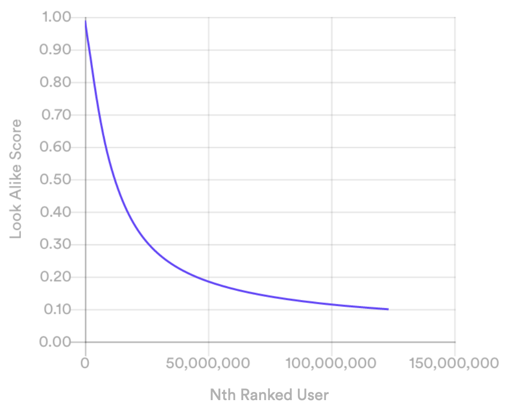
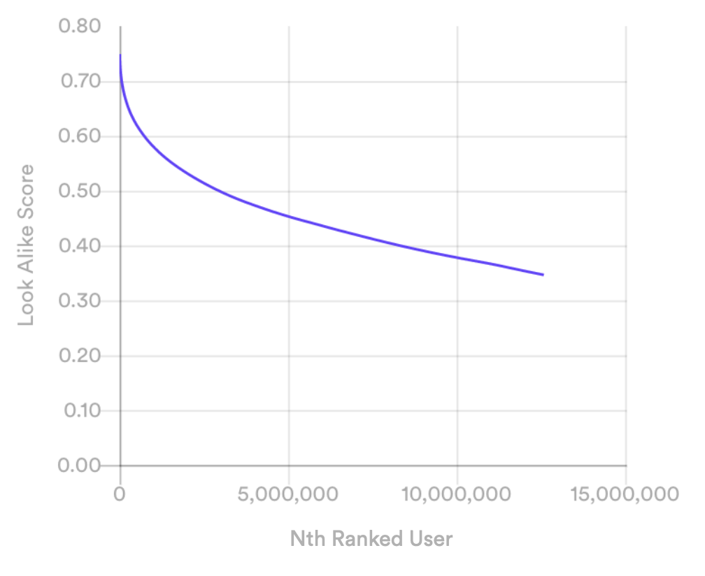
The curve for Pipeline A slopes sharply downward, indicating that it found more differentiation between its highest- and lowest-scored users than Pipeline B, whose curve slopes more gently.
Related Links
- Building a Look Alike Pipeline
- Classification Pipeline Performance
- Regression Pipeline Performance
- Future Events Pipeline Performance
- Uplift Pipeline Performance
- Recommendations Pipeline Performance
Still have questions? Reach out to support@mparticle.com for more info!