How Can We Help?
Future Events Performance
How do I evaluate the performance of my Future Events pipeline?
Once you’ve built a Future Events pipeline, Cortex makes it easy to explore results and learn more about your pipeline’s predictive power. In this guide, we’ll show you how to evaluate the performance of a Future Events pipeline in Cortex.
Cortex summarizes performance of any pipeline in three ways: Pipeline Quality, Performance Metrics, and Performance Graphs. The following sections describe how to interpret each of these specifically for a Future Events pipeline.
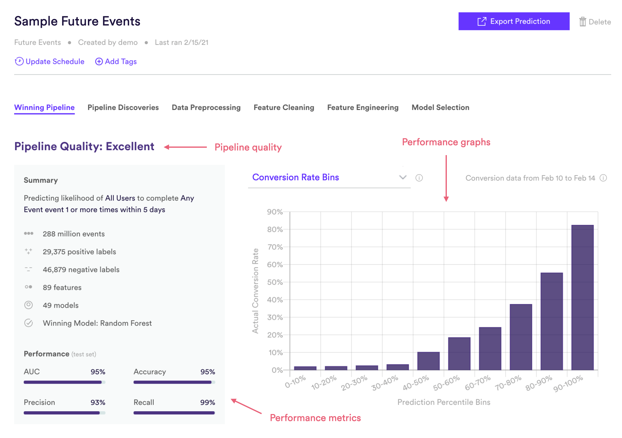
Future Events Pipeline Quality
Pipeline Quality gives you a quick sense for your pipeline’s performance without having to scrutinize any technical metrics. A pipeline’s Quality is meant to serve as a rough guide for how well its predictions match reality, but in truth what constitutes good performance depends on the difficulty of the problem – sometimes “Average” actually represents the best possible performance that can be achieved with the data at hand.
For Future Events, Pipeline Quality is determined based on AUC, a common measure of performance for binary classification machine learning. AUC is described in more detail in the Metrics section below.
| Pipeline Quality | AUC |
| Excellent | >85% |
| Very Good | 75-85% |
| Good | 65-75% |
| Average | 55-65% |
| Below Average | <55% |
Future Events Performance Metrics
Cortex publishes four well-known performance metrics for each Future Events pipeline. Each of these metrics is computed on a test set — that is, a random collection of users withheld from training so that we can measure performance on data your pipeline has never seen before. Future Events predictions on the test set are also wound back in time so that we can compare them against which users actually went on to convert.
To frame these metrics in real terms, consider a Future Events pipeline which predicts each user’s probability of purchasing within the next 14 days. Note however that your Cortex account can be configured to make predictions about any type of object tied to your event data (e.g. commerce items, media content, home listings, etc.).
AUC
AUC (or AUROC, short for Area Under the Receiver Operating Characteristics curve) is one of the most commonly-used measures of performance for machine learning classifiers. It is represented as a percentage from 0-100%. The higher your pipeline’s AUC, the better its predictive power.
AUC is derived from the ROC curve (read here for more details), but can be interpreted in a more intuitive way: if a positive and negative label are both drawn at random, what is the probability that the positive label was given a higher prediction than the negative label? In our example above, a positive label is a user who purchased within 14 days, while a negative label is a user who did not end up purchasing in the window.
Precision
Of all the users that your pipeline predicted to be in the positive class, what percentage were actually in the positive class? In terms of our example, of all the users predicted to purchase within 14 days, what percent actually did? Read here for more details.
Recall
Of all the users that were actually in the positive class, what percentage did your pipeline predict to be in the positive class? In terms of our example, of all the users who purchased within 14 days, what percent were predicted to do so? Read here for more details.
Accuracy
What percent of all users did your pipeline classify correctly across both the positive and negative classes? In terms of our example, what percent of all predictions were correct (for both users who were and were not predicted to purchase)? Read here for more details.
*Note: Precision, recall, and accuracy are reported at the maximum F1 score of each Future Events pipeline’s precision-recall curve (described in the Performance Graphs section below).
Future Events Performance Graphs
Like the performance metrics described above, performance graphs are generated based on data from a test set — that is, a random collection of users withheld from training so that we can measure performance on data your pipeline has never seen before. Future Events predictions on the test set are also wound back in time so that we can compare them against which users actually went on to convert.
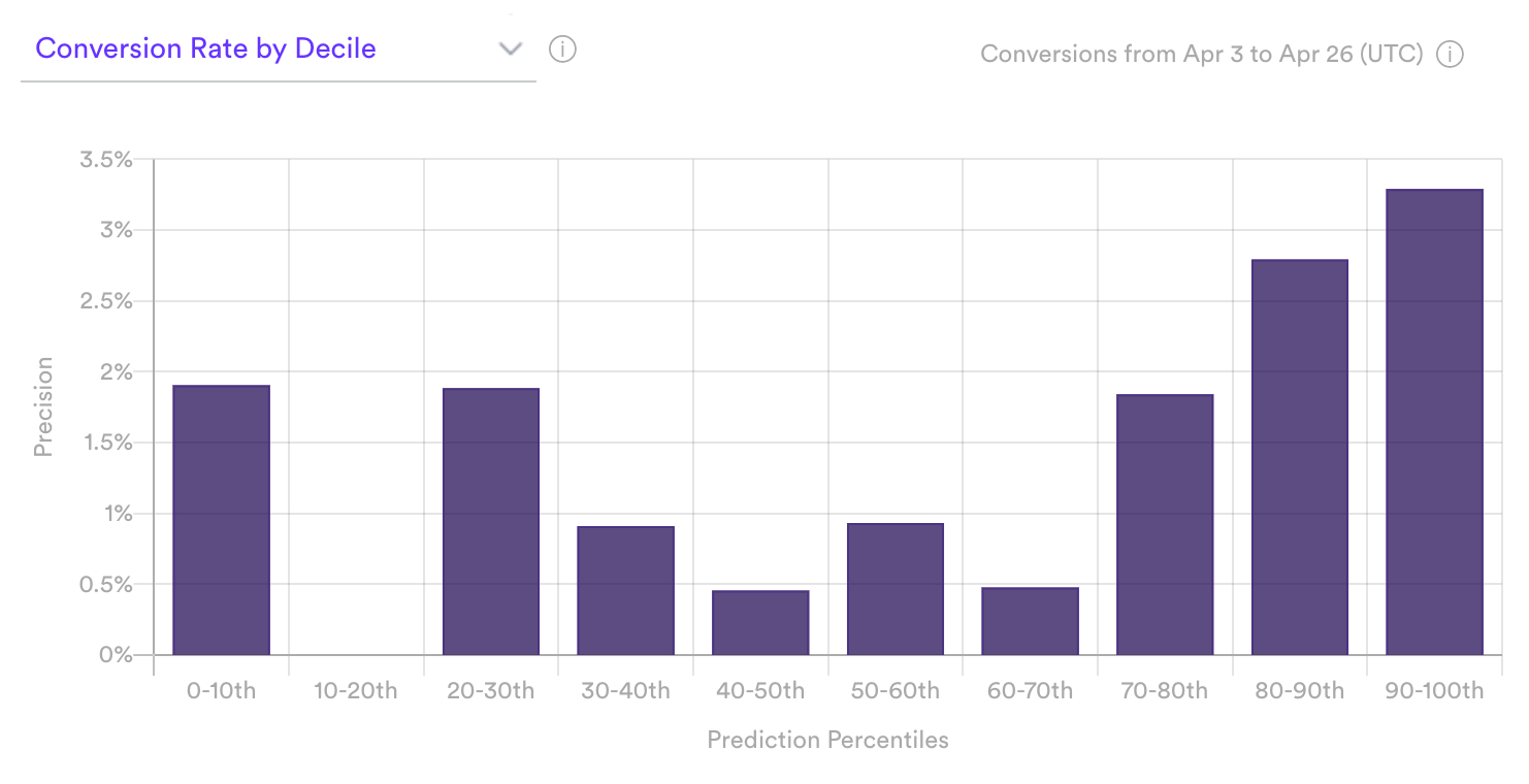
Conversion Rate by Decile
The Conversion Rate by Decile graph visualizes how well your pipeline is able to rank users based on their likelihood of converting. To do this, Cortex takes a set of users that were withheld from training (called the test set) and divides them into 10 equally-sized bins (or deciles) based on their predicted conversion probabilities. The first bin (0-10th percentile) contains the 10% of users with the lowest predictions, while the tenth bin (90-100th percentile) contains the 10% with the highest predictions. Cortex then observes what percent of users in each bin went on to actually convert (i.e. precision). These results are visualized in this graph.
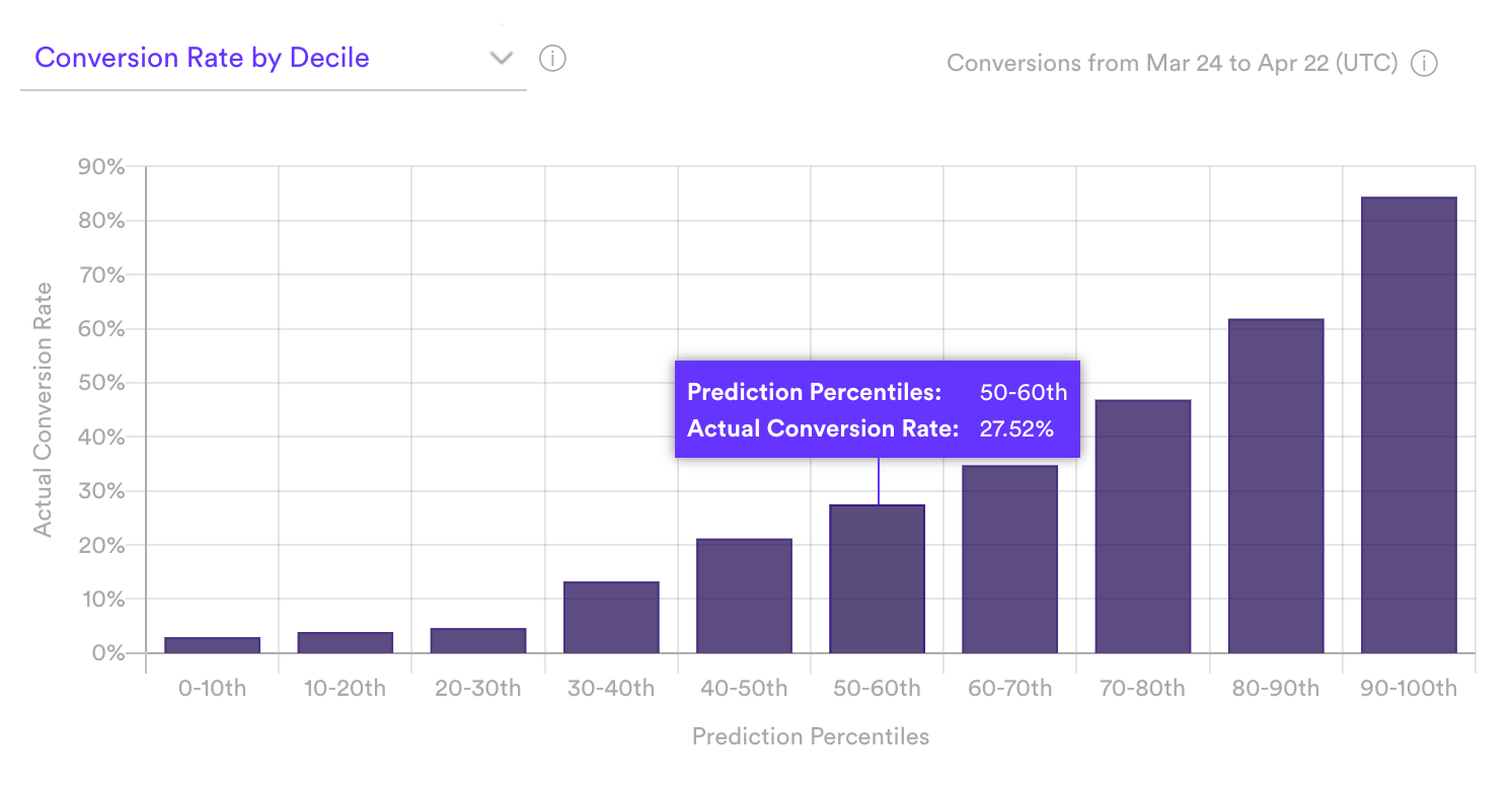
If your pipeline’s predictions are accurate, percent of total conversions will increase steadily and sharply from decile 1 to 10. In terms of our example pipeline, this pattern would indicate that the users Cortex identified as high-likelihood actually went on to purchase over the subsequent 14 days more often than users scored as low-likelihood.
A weaker performing pipeline, like the one shown below, will likely not show steadily increasing conversion rate across deciles. This typically occurs when the volume of data is low.
Precision-Recall Curve
The precision-recall curve measures the tradeoff between two important ML metrics, as the threshold for a positive class prediction changes. The more accurate your pipeline, the larger the area beneath this curve.
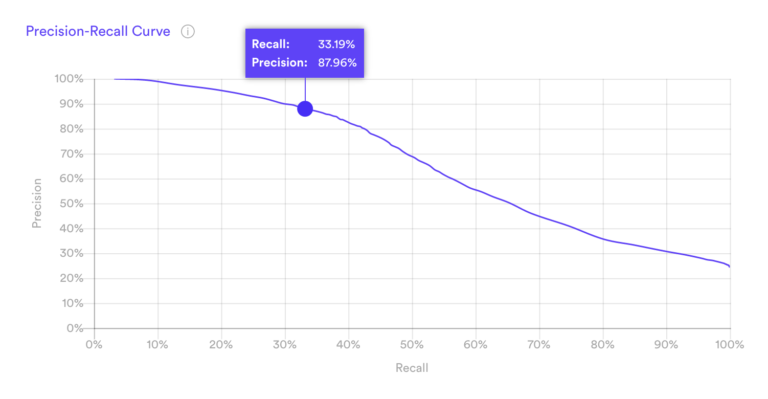
For a given pipeline, precision and recall are often inversely related — improving one usually means sacrificing the other. To understand why, note first that Cortex’s Future Events predictions take the form of a “conversion rate”.
| user_id | conversion_rate |
| ABC | 0.934 |
| DEF | 0.817 |
| … | … |
| UVW | 0.0127 |
| XYZ | 0.0092 |
In reference to the above table:
- This sample table is sorted in descending order of predicted conversion rates.
- User ABC is predicted as most likely to convert (93.4%).
- User XYZ is predicted as least likely to convert (0.9%).
Conversion rates are useful in that they tell you something about the confidence of each prediction. But precision and recall measure whether a pipeline’s predictions are right or wrong, so in order to compute these metrics we must first set a conversion rate threshold. Any user scored above this threshold is considered a positive class prediction (e.g. predicted to purchase within 14 days), and any user below this threshold is considered a negative class prediction (e.g. predicted not to purchase within 14 days).
Raising this threshold is likely to increase our pipeline’s precision but lower its recall. Imagine setting a high threshold such that only a few high-confidence users are considered positive predictions (say, those with conversion rates above 90%). Our pipeline would get a lot of these predictions “right” (i.e. have high precision), but would miss out on many other users that end up converting (i.e. have low recall). If we set a low threshold so that most predictions are considered positive (say, conversion rates above 10%), many of these users won’t end up converting (low precision), but we’d correctly capture almost all those that do convert (high recall).
The Precision-Recall Curve measures this tradeoff as we vary the conversion rate threshold from high (left side of the curve) to low (right side).
Related Links
- Building a Future Events Pipeline
- Uplift Pipeline Performance
- Recommendations Pipeline Performance
- Look Alike Pipeline Performance
- Classification Pipeline Performance
- Regression Pipeline Performance
Still have questions? Reach out to support@mparticle.com for more info!