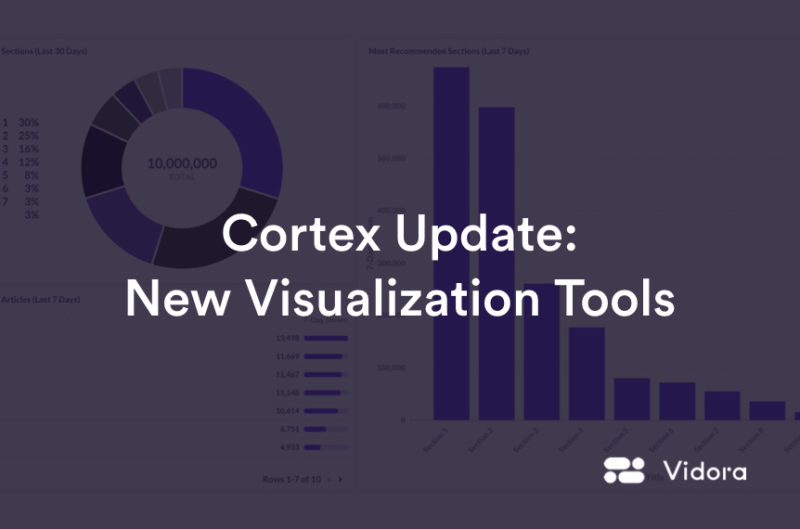
In order to successfully deploy and automate Machine Learning into data workflows, performance tracking and data visualizations play a crucial role. This is why recently Vidora revamped our visualization tools in Cortex to enable higher quality visualizations. Not only do these new visualizations look better, but they also provide more flexibility, allowing us to show you more about your pipelines and the business metrics those pipelines impact.
Three primary areas where these expanded capabilities are already helping our customers are –
- Pipeline and Model Understanding – Understanding why a pipeline made certain predictions is important to ensuring that the pipeline is making the right predictions. Cortex already provides a variety of model understanding visualizations – this release will allow Cortex to provide even deeper insights.
- Machine Learning Monitoring – Cortex now provides additional visualizations to measure and track the performance of pipelines and the inputs to pipelines over time. For pipelines which are continuously learning, tracking performance over time ensures consistency. Tracking the inputs to pipelines enables businesses to quickly diagnose performance changes in pipelines.
- Business Metrics – The new visualizations will enable our customers to track key business metrics impacted by machine learning pipelines including revenue, conversions, CTR, and purchases.
Below are a few examples of visualizations that can help you get a deeper understanding of your predictions and how well those predictions are doing at increasing business outcomes.
Example #1 – Model Feature Understanding Visualization
When a new prediction is created, it’s important to understand the data and customer behaviors that were important in creating the predictions. The new visualizations in Cortex can allow you easily to see the correlation between the prediction values and different data features.
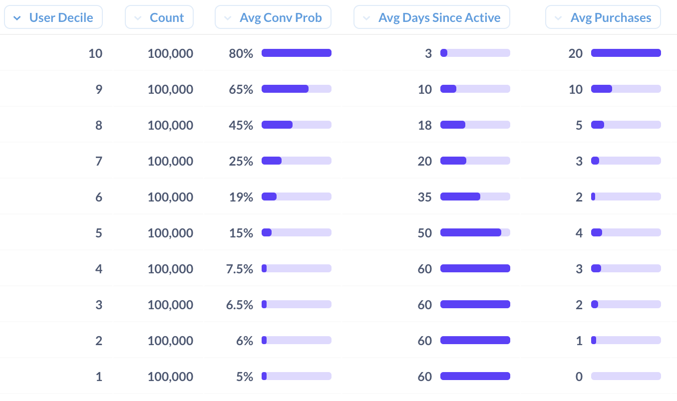
Feature understanding plot. Each column represents a unique feature created by Cortex. Each row represents a conversion decile. I.e. users in row 10 are very likely to convert while users in row 1 are users not likely to convert. Using this visualization users can visualize how feature values change as a function of conversion probabilities.
Example #2 – Recommendation Engagement Rates
When deploying recommendations, it’s important to track engagement over time to ensure the recommendations are leading to high levels of activity. Because Cortex is both creating the recommendations and tracking user behavior over time, customers can create recommendations and track the performance all within the same interface.
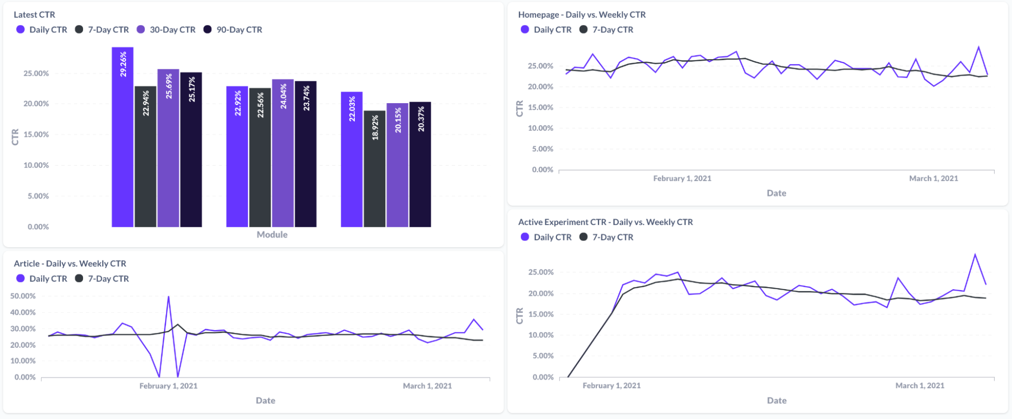
Tracking CTR over different time periods and on different sections of a website.
Example #3 – Content Performance from Personalization Analysis
Along with tracking recommendation engagement, Cortex can also track the actual recommended values over time. For example, a media company can easily track the most commonly recommended sections and articles. This can help give a better sense of the most popular content being recommended and consumed by the end users.
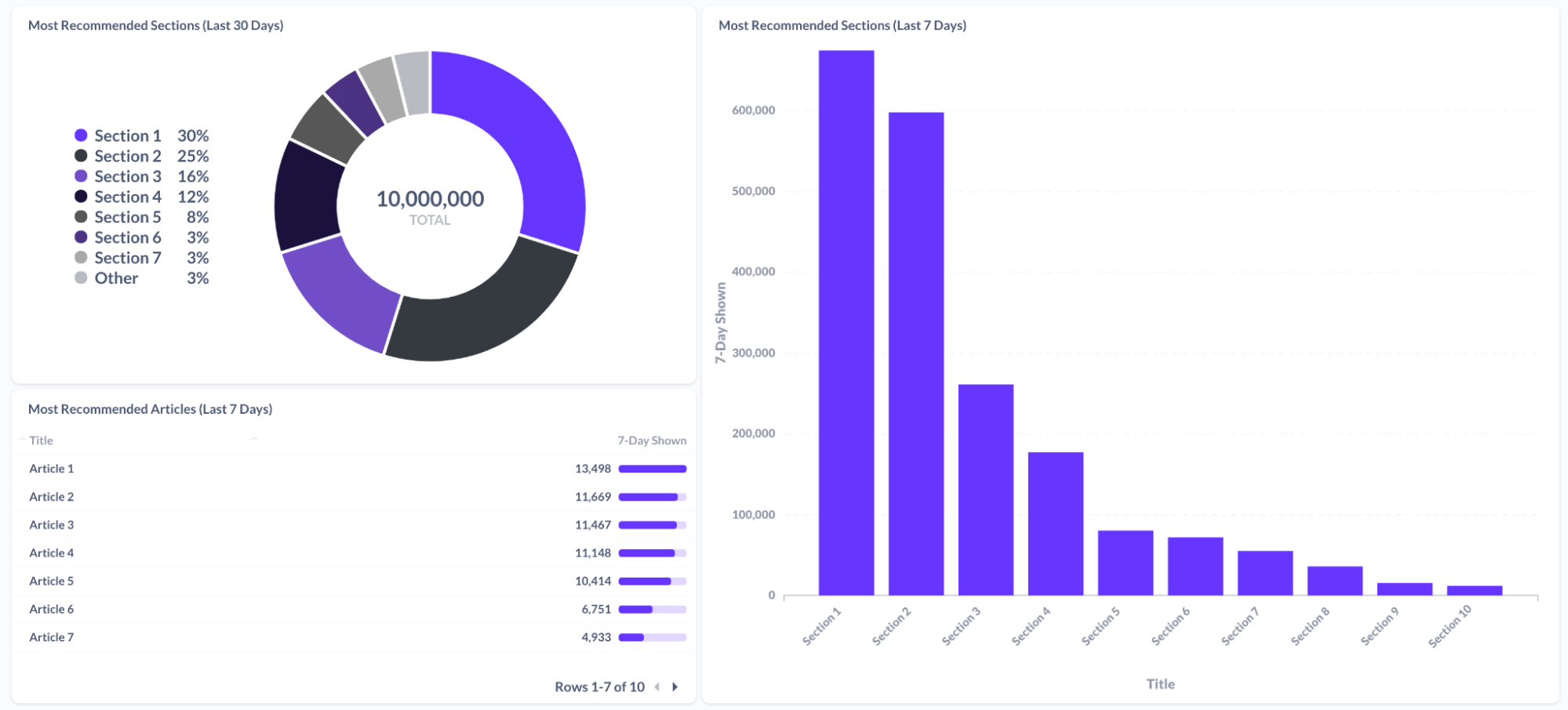
Business metric visualization – content performance. Various visualizations of content performance for onsite personalization experiences.
These new Cortex visualizations are incredibly powerful in enabling a broad number of visualizations and a deeper understanding for the impact of machine learning. The visualizations can also be customized to the unique needs of your business. If you have any questions or would like to take advantage of these new visualization capabilities – please feel free to reach out to us at info@vidora.com!