Today Vidora launched a set of Pipeline Performance Graphs built on top of Cortex’s new Automated Pipeline Testing framework. Traditionally, ML performance metrics are too technical to tell you anything useful about what the technology can do for your business. Of course, everybody wants to confidently deploy ML across their organization. Therefore, you need to know in plain terms how well your pipeline can predict key business goals.
Pipeline Performance Graphs solve this problem. It does so by visualizing in simple, intuitive terms how well your pipeline’s predictions match real-world outcomes. This gives you confidence in the accuracy of your ML system. As a result, you can focus on the best strategies for deploying quickly across your business.
Deploy With Confidence and Speed
Building a new ML pipeline in Cortex is as easy as a few clicks, but how can you be sure that your pipeline is robust enough to rely on for key strategic initiatives? Technical metrics like AUC, precision, recall, and F1 score don’t offer a clear picture of what sort of business results to expect. But Pipeline Performance Graphs do.
Pipeline Performance Graphs let you quickly gauge your pipeline’s accuracy by visualizing how closely its predictions track real-world conversions over time. No more scrutinizing technical performance metrics or conducting manual tests. Now, business people can focus on business strategies and trust that the ML is doing its job. This means fewer tests, faster deployment, and better results for your business.
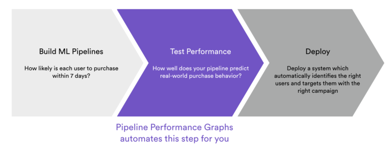
Pipeline Performance Graphs cut down the time it takes for you to deploy a reliable ML system
How does it work?
Say you’re a marketer who builds a pipeline in Cortex to predict each user’s likelihood of purchasing from your ecommerce platform within the next 14 days. When your pipeline finishes training, Cortex automatically creates three cohorts based on your pipeline’s predictions –
- High Propensity: the 10% of users Cortex predicted as most likely to purchase
- Low Propensity: the 10% of users Cortex predicted as least likely to purchase
- Control: a random selection of 10% of users
For each of these three cohorts, your Performance Graph tracks the total number of conversions over the pipeline’s 14-day prediction window. In other words, how does real-world purchase behavior compare between users that Cortex predicted as very likely and very unlikely to purchase? Once you’ve verified that your pipeline can identify the right users, you can focus your efforts on how to most effectively target them.
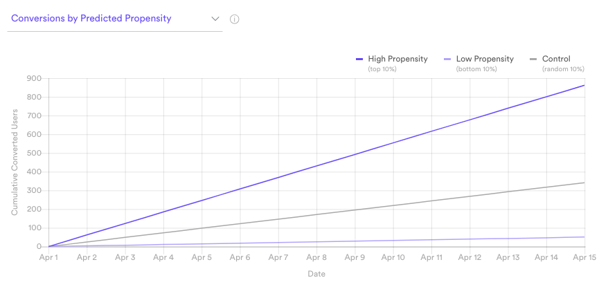
Do high-propensity users actually purchase more than low-propensity users?
Learn More About Cortex
Cortex enables our partners to build in minutes complex ML pipelines that used to take months. Now, with Pipeline Performance Graphs, Cortex eliminates the testing bottleneck as well. Interested in seeing a demo or learning more? Let us know by emailing info@vidora.com!